


Moody is the new sexy

Earlier this year I was talking to a friend about variant cover artists and he had a brilliant suggestion: you should do a sexy variant cover.
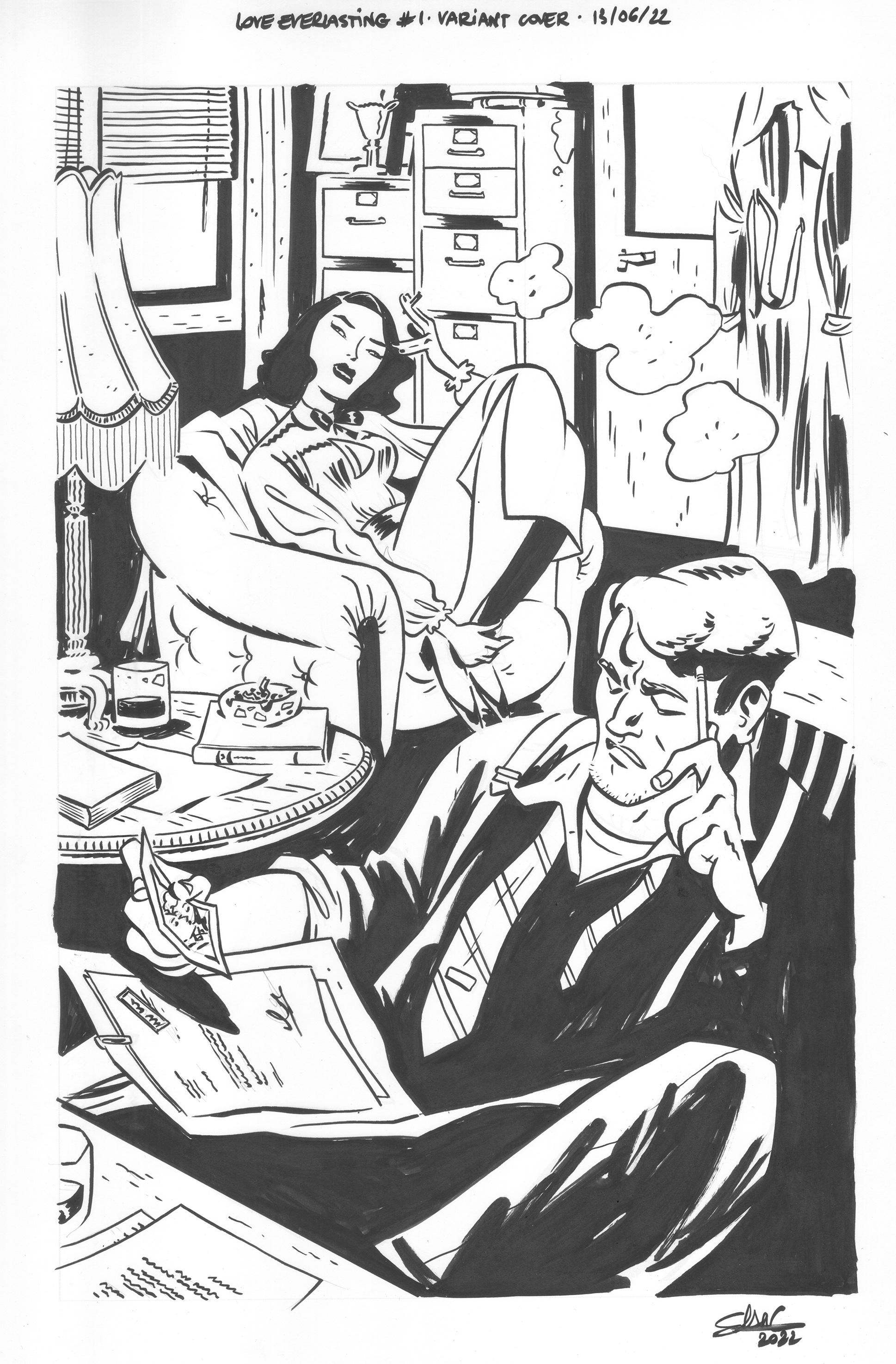
I don’t know if it ended up as sexy as my friend was picturing, but it’s definitely moodier than what we’ve seen of Joan. Playing on tropes is FUN. Heck, our whole comic plays on the romance tropes. I went for the suspicious-wife-hiring-a-private-eye-to-spy-on-her-husband-but-then-falling-for-said-private-eye. I struggled for years with covers. I was never comfortable, could never find my angle. I think for a long while I tried to emulate covers I loved instead of looking within for my strengths. My strength lies with story. It’s what I love to do and what I’m best at. The moment I started drawing covers as their own pieces of story instead of illustrations (like Matias Bergara’s gorgeous cover-I’m incapable of coming up with something like that) everything aligned.
Tom write the main covers for Love Everlasting. It’s unusual. The artist usually comes up with the concept but in our case we have balloons. Rather than have Tom trying to fit the lines to the art, we do it the other way around. It’s generally a general concept. Issue 4’s cover was something like: Joan and Dane kissing in the middle of No Man’s land + their lines. For this one, we didn’t need to, because it’s textless.
I started by toying with different angles until landing on the one below. It’s a super basic sketch that gives me enough to move on to pencils. I printed this loose sketch on a 8 by 11 in sheets of paper, in blue, at 5% opacity. It’s my roadmap. I pencil small, sometimes even smaller than that. It’s much faster, and I find I’m usually better at this scale.

My penciling process is a bit messy at that point. I moved away from digital pencils about a year ago and I’m still re-adjusting to working on paper. Most of the time I’ll pencil different bits of a cover or a page on different sheets of paper and assemble everything in photoshop. The detective in that piece was done separately for instance. I wish I could always picture a gesture in my head perfectly and the drawing part was just a formality, but the reality is that in my first pass, I’m still figuring out the pose. As a result, it’s often not as loose as I’d like. That means I usually pencil characters twice. I don’t mind it, though. I like the process of refining an idea.


When I’m happy with what I have, I scan everything, assemble on Photoshop, fix any mistakes I can spot (Artist tip: flipping your canvas vertically makes it easier to see composition and drawing mistakes), and I print this out on a larger sheet of paper this time. 11 by 18 in sheet of Bristol with a satin finish. Works best with pens, I find, I like smoooooooth inks.
I don’t mean to say that inking is easy (it is not) but it’s definitely the relaxed phase for me. At that point, the tough parts, composition and gesture, have been figured out and I can just focus on the physical joy of moving the pen. It’s like yoga but fun.
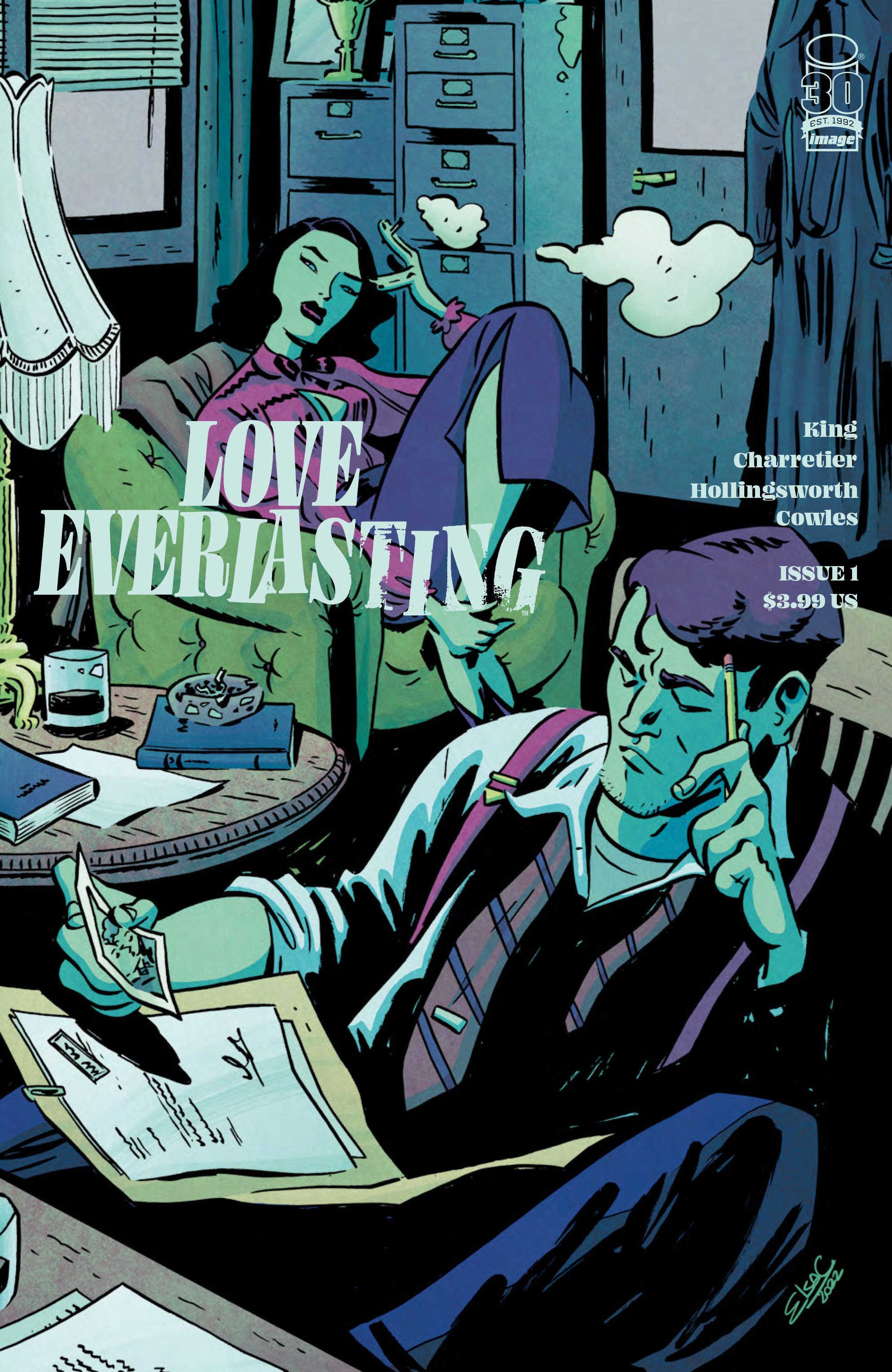
Then what can I say? Matt Hollingsworth steps in with his genius colorist tricks, and ties everything together!
You can still pre-order my variant cover C (until July 18!) with the Diamond Code JUN220026.
And traps wraps our cover series! I’ll have one last post going up tomorrow, right before FOC to sum everything up nicely.
Are you guys closer to figuring out which cover(s) you’ll pick up? Tell me in the comments!
Much love,
Elsa
 | A guest post by
|
This cover is sexy and beautiful!
Great. I just wish I could read the titles on the books...